Poly M
Shaping a brand from its iconic brick
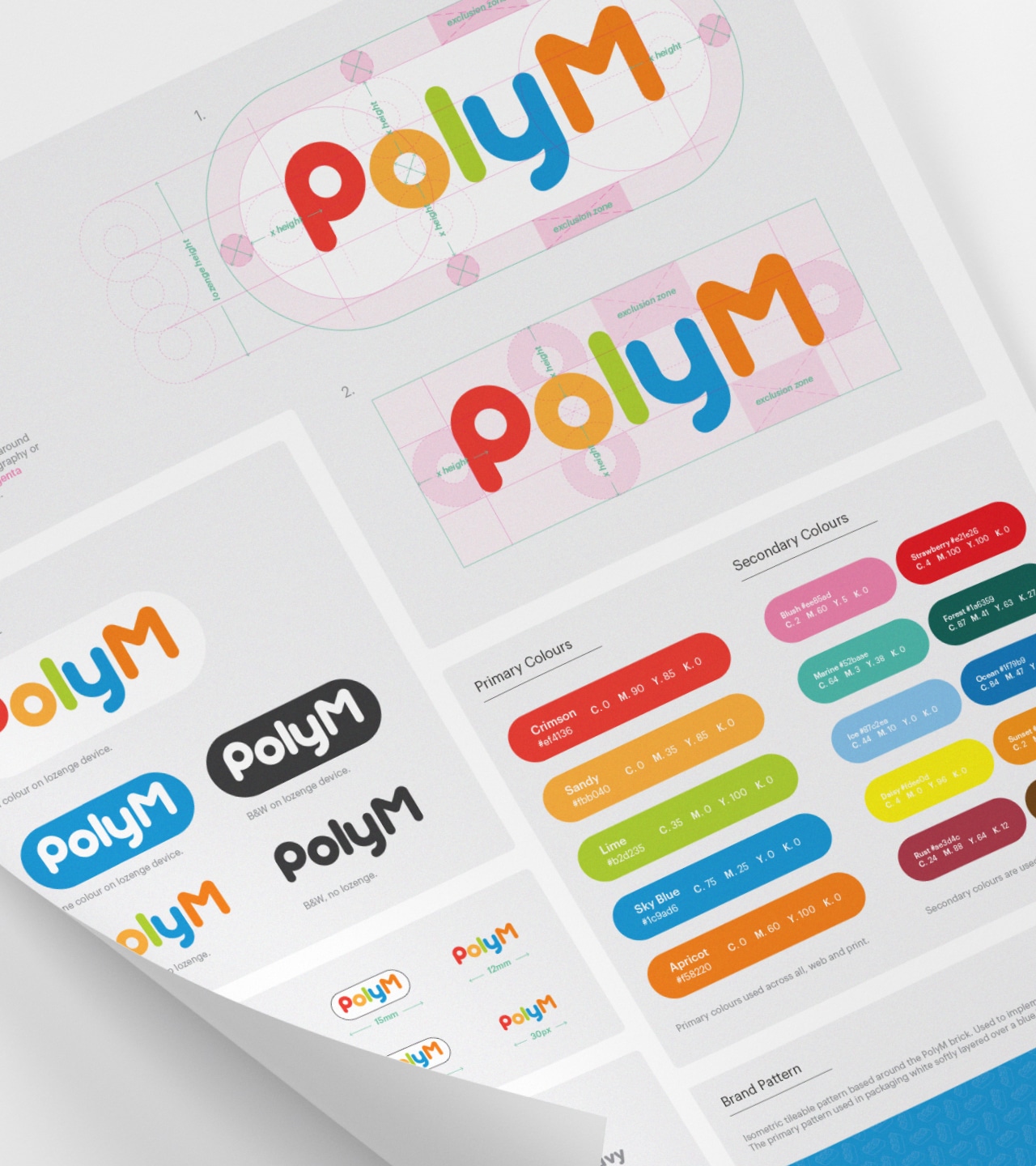
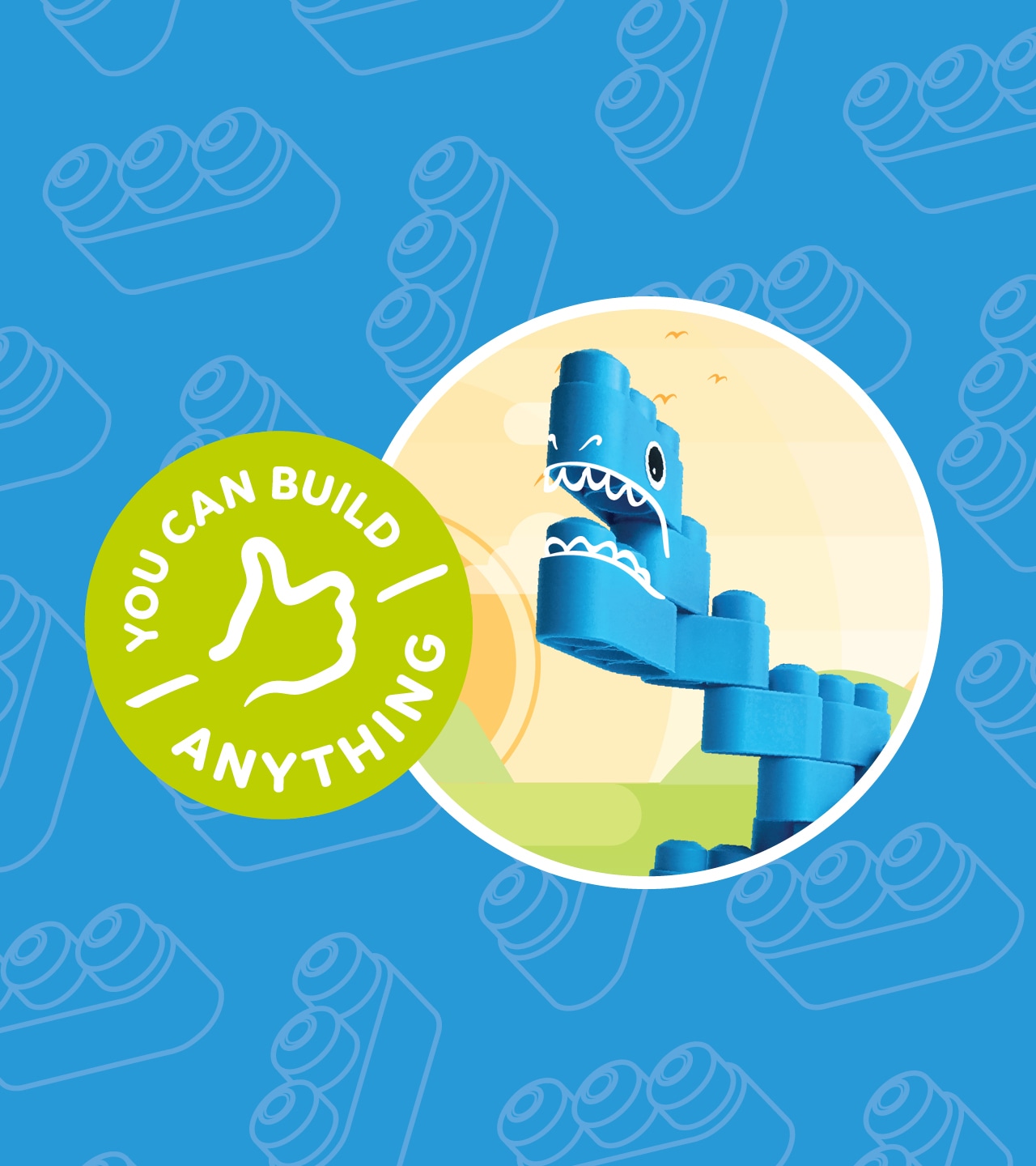
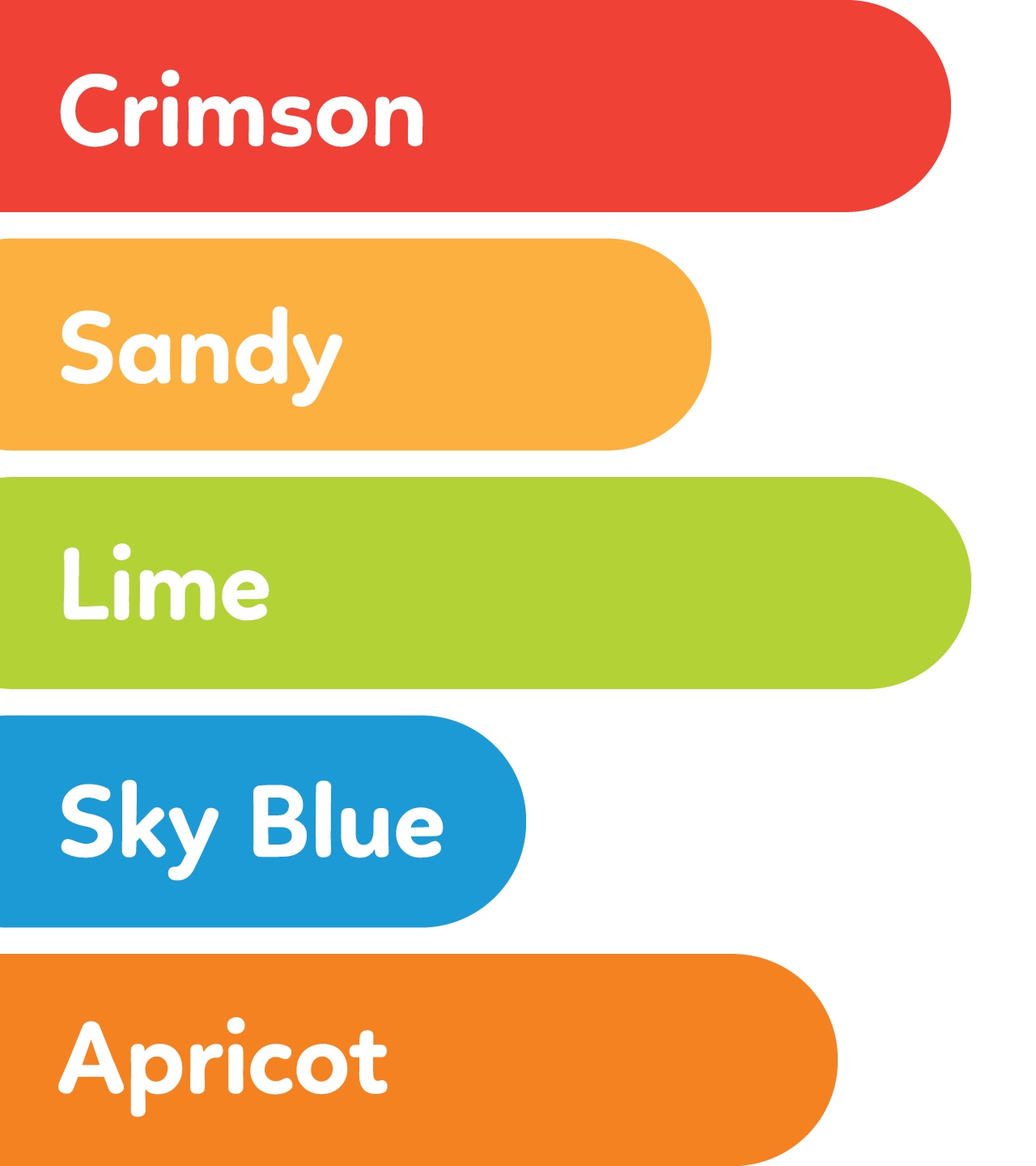
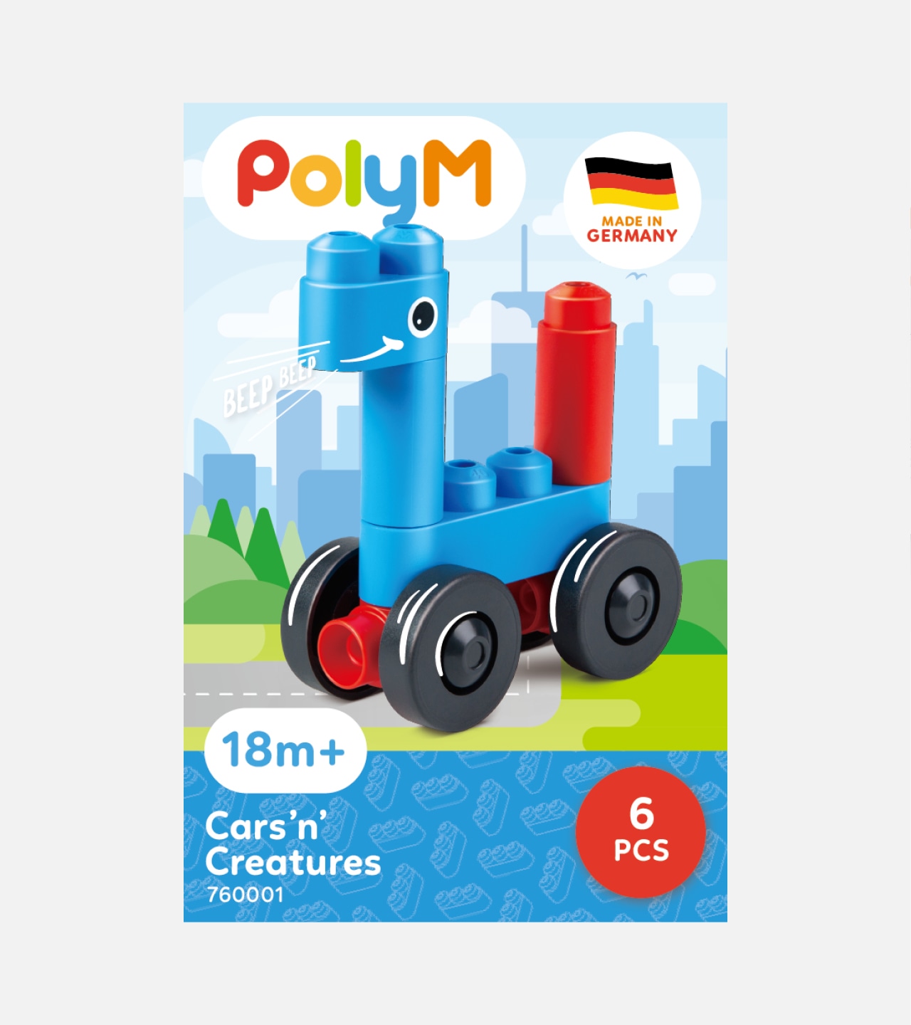
We rebranded Poly M, a 30-year-old children’s construction toy from Germany, by drawing directly from its iconic soft, rounded brick to create a logo with smooth, curved forms that reflect the product itself. The result is a clean, friendly, and instantly recognisable identity that appeals to children while remaining clear and legible for adult buyers.
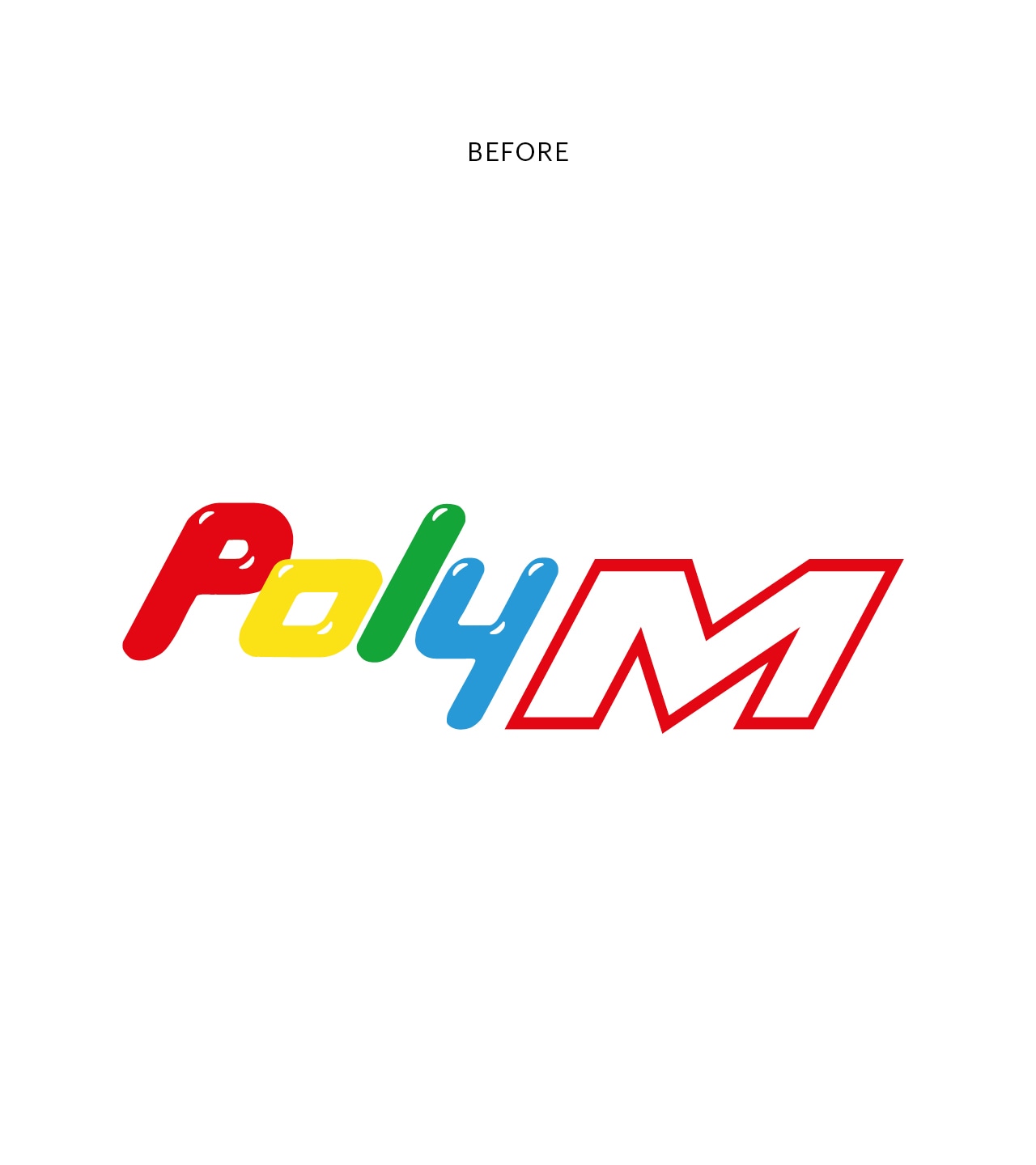
The Problem
We were tasked with re-branding PolyM, a multifunctional children’s construction toy produced in Germany over the last 30 years.
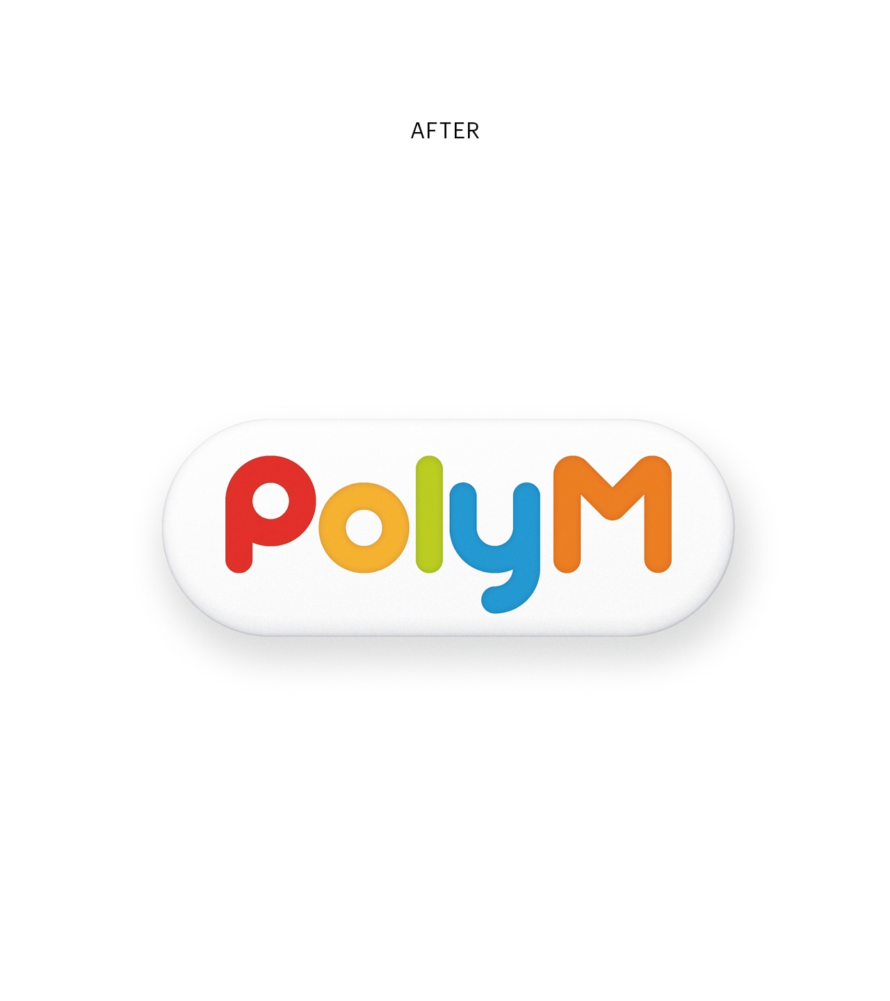
The Solution
We drew inspiration directly from the product itself, its iconic rounded brick made from soft, safe polyethylene. This informed a new logo built from smooth, curved contours that mirror the physical qualities of the toy, creating a design that feels intuitive and connected to the product.
The Result
The refreshed identity is clean, approachable, and instantly recognisable. Its simple, rounded forms make it engaging for children while remaining clear and legible for adult shoppers, resulting in a brand that communicates effectively across audiences.
Sector
Branding