TK Maxx
A story of origin, brought to the shelf.
Great products deserve stories that are just as rich as what’s inside. When purpose, provenance, and design come together, packaging can do more than sit on a shelf. Fit can carry meaning, spark curiosity, and build a deeper connection with the people who choose it. This project was about turning a chocolate range into something that communicates not just flavour, but impact.
The Problem
TK Maxx needed distinctive packaging for its own‑brand Fairtrade chocolate, one that celebrated its single‑origin Ugandan cocoa and helped communicate the positive impact it has on local farming communities.
The Solution
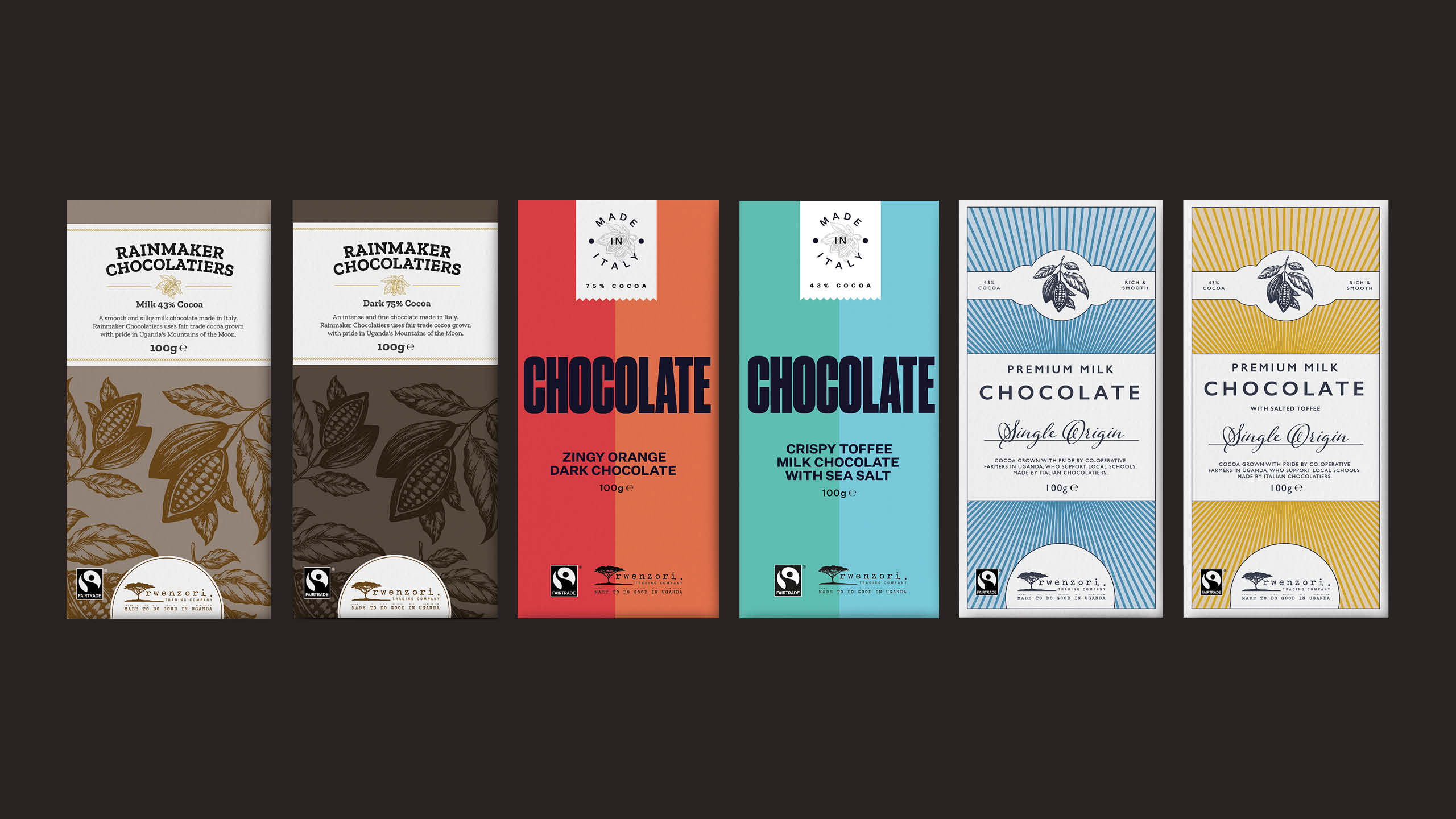
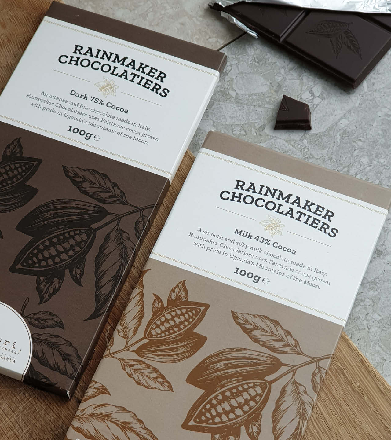
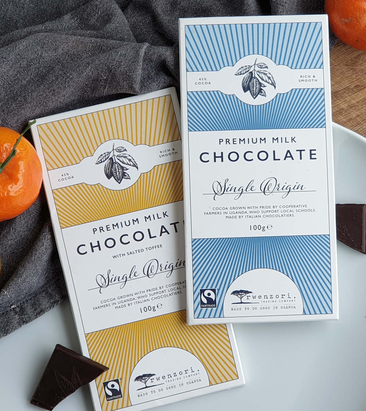
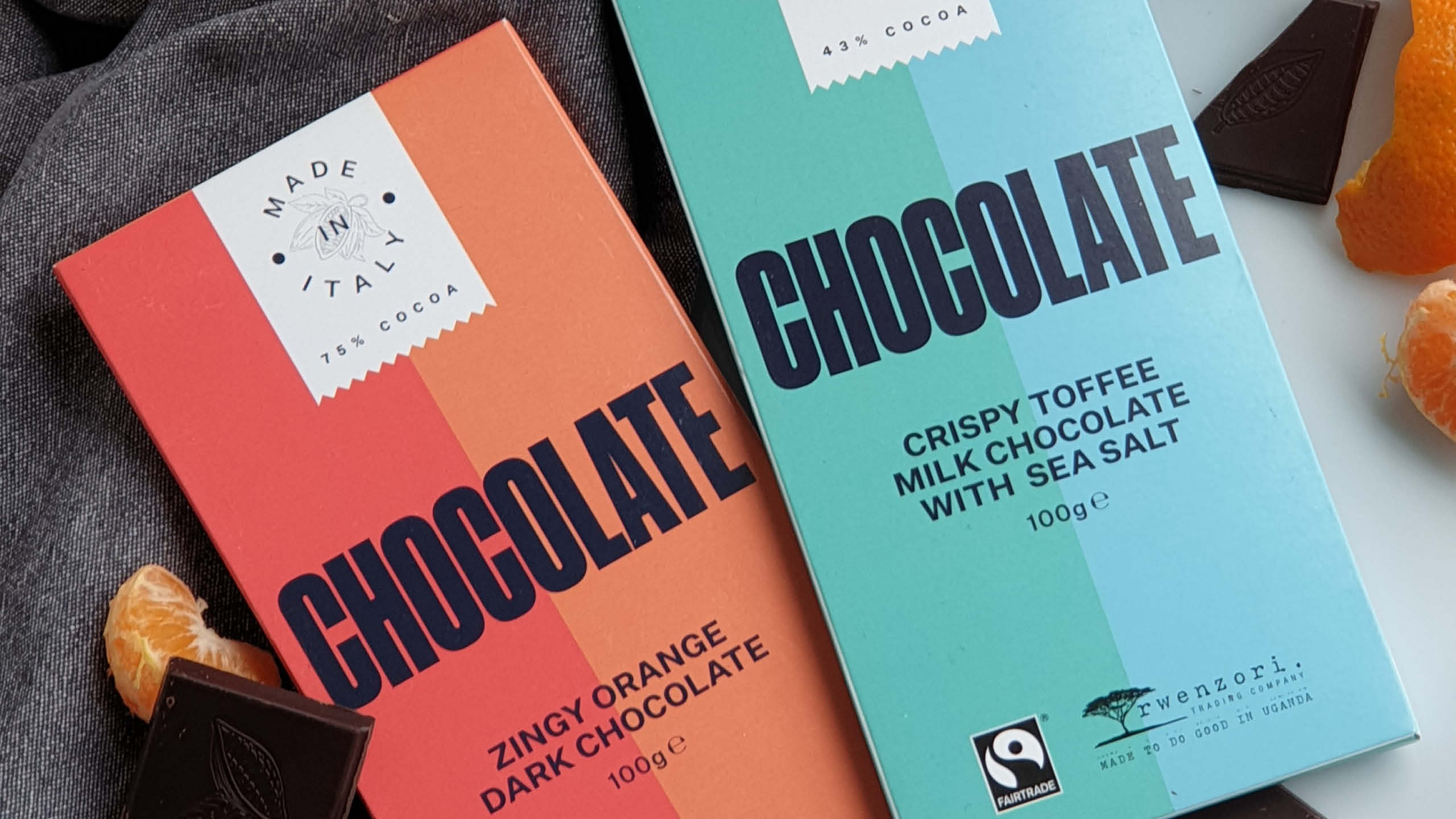
We designed packaging under the overarching ‘Rwenzori Trading Company’ brand, creating four unique sub‑brands to differentiate the flavour range while maintaining a cohesive visual identity.
The Result
The final packaging clearly reflects the chocolate’s origin and story, helping to highlight the vital income it provides to Ugandan farmers and the role it plays in supporting their children’s education.
Sector
Retail Graphics