Webbs
Cultivating a timeless new look
We evolved Webbs’ 200-year-old brand into a refined, nature-led identity, creating a cohesive visual system that unifies its diverse operations while preserving heritage and enabling future growth.
The Problem
Webbs has a 200-year history, evolving from seed merchants to Queen Victoria, into a chain of garden centres with a strong e-commerce business, B2B nurseries, restaurants, and manufacturing their own products. We were approached by the owners to help overhaul their dated brand identity to help provide a platform for their future business plans.
The Solution
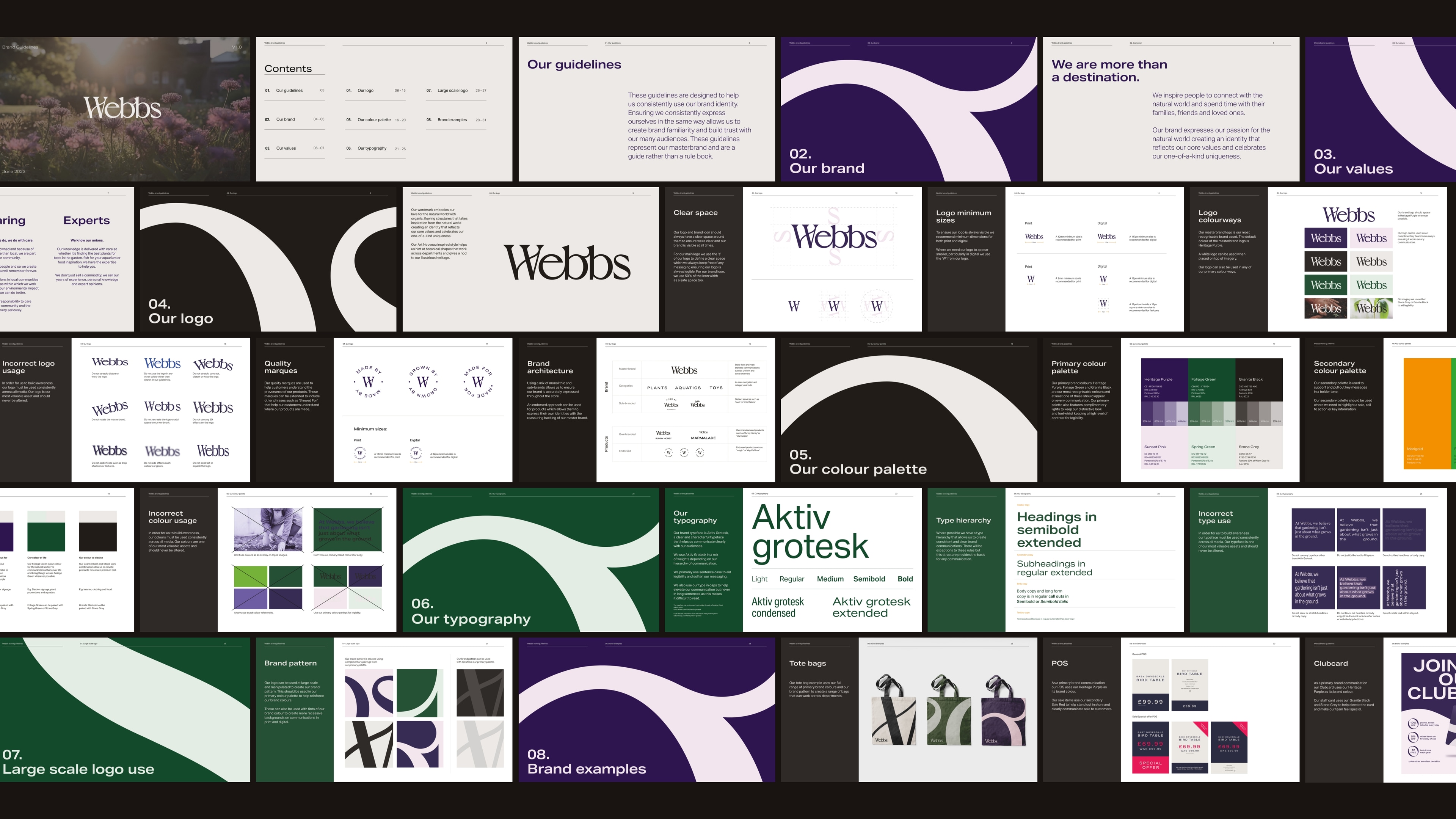
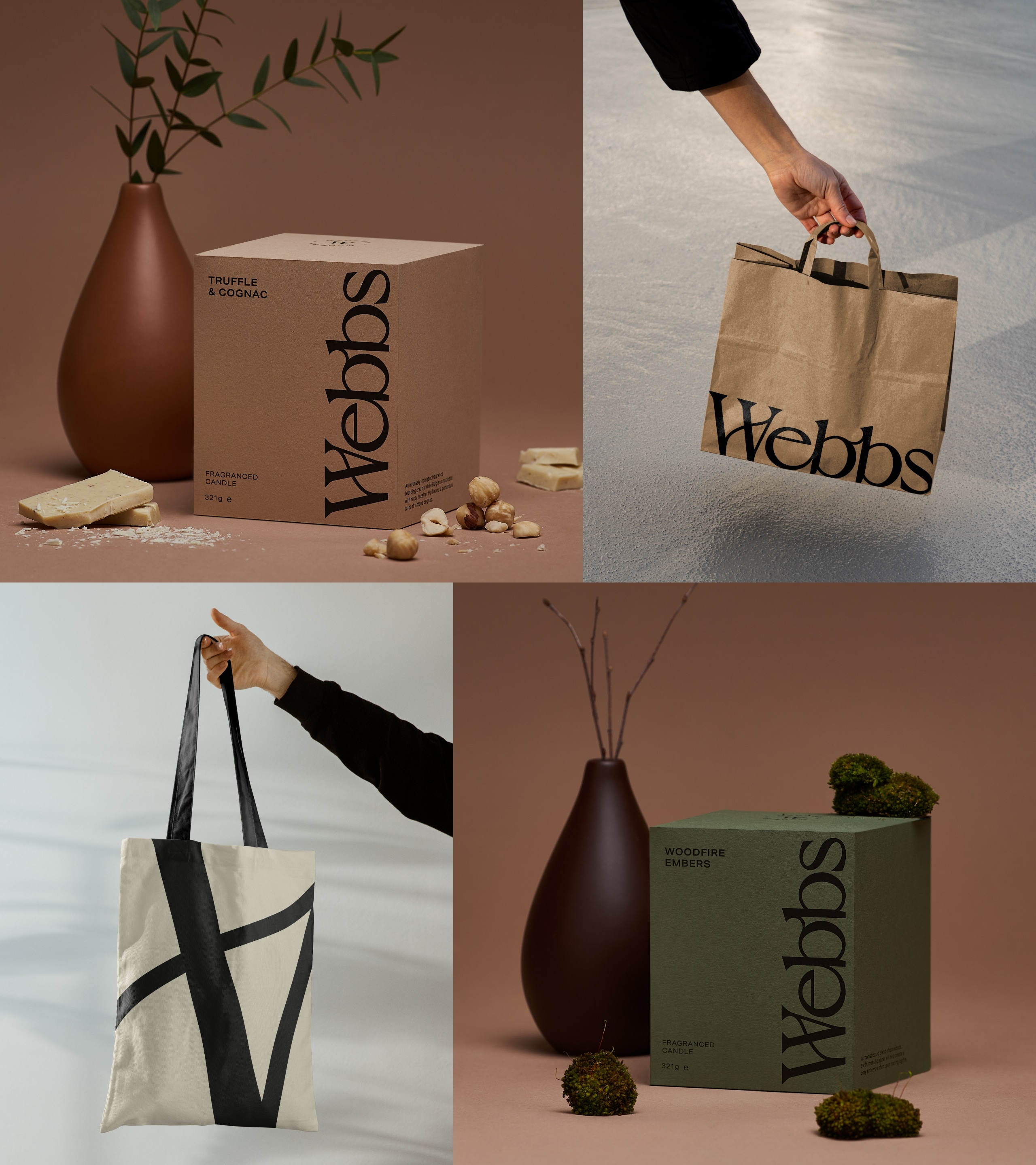
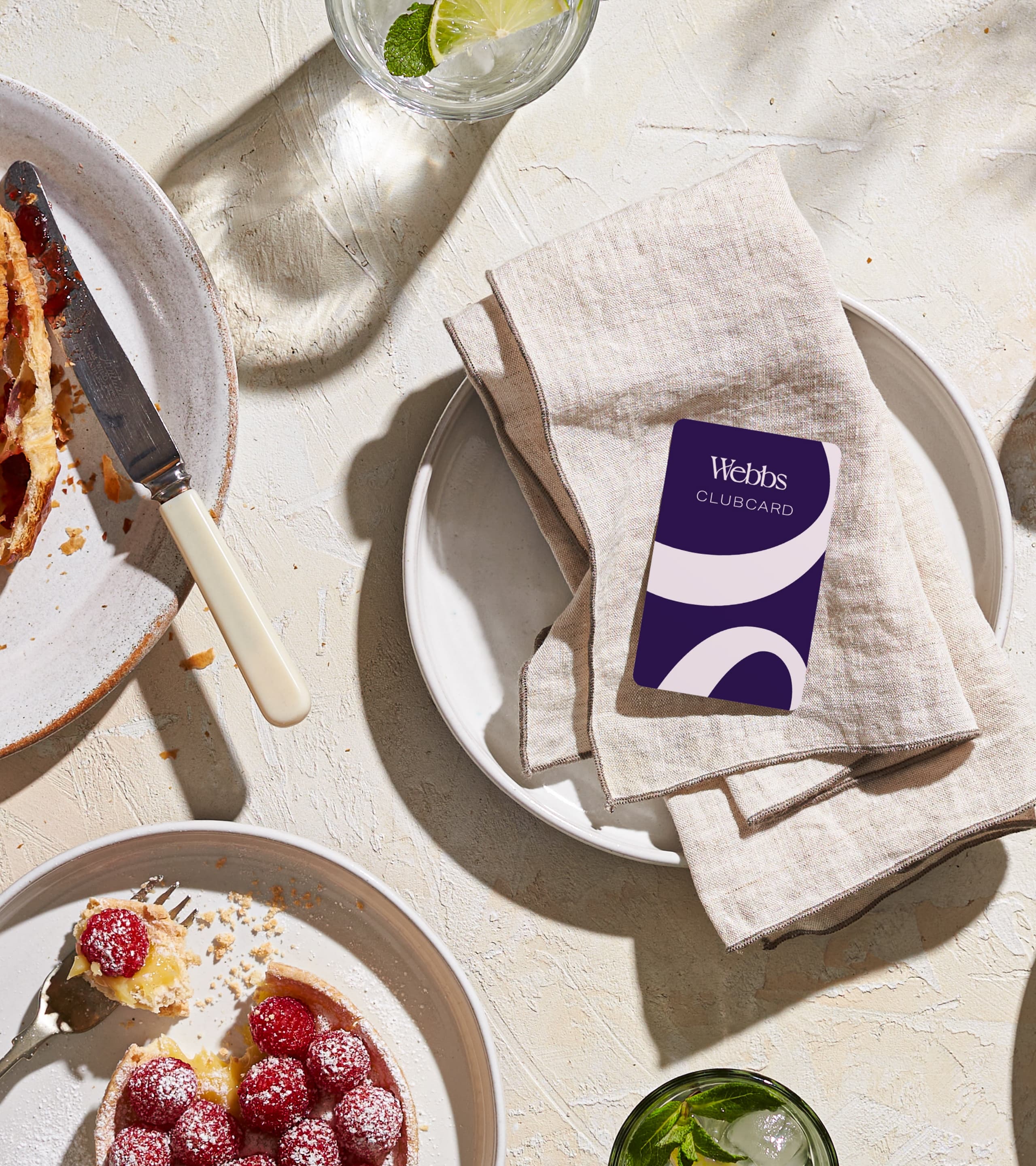
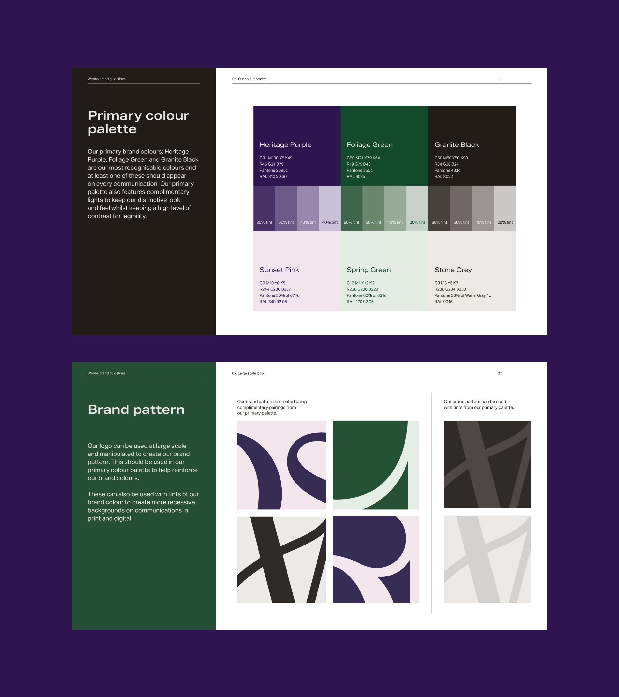
Purple was strongly associated with the brand, as confirmed by our extensive consumer research. We created a complementary palette to enhance products and in-store communications. Collaborating with Webbs’ internal team, we redesigned the identity with a unique “natural world” positioning that informed every aspect of the business.
The Result
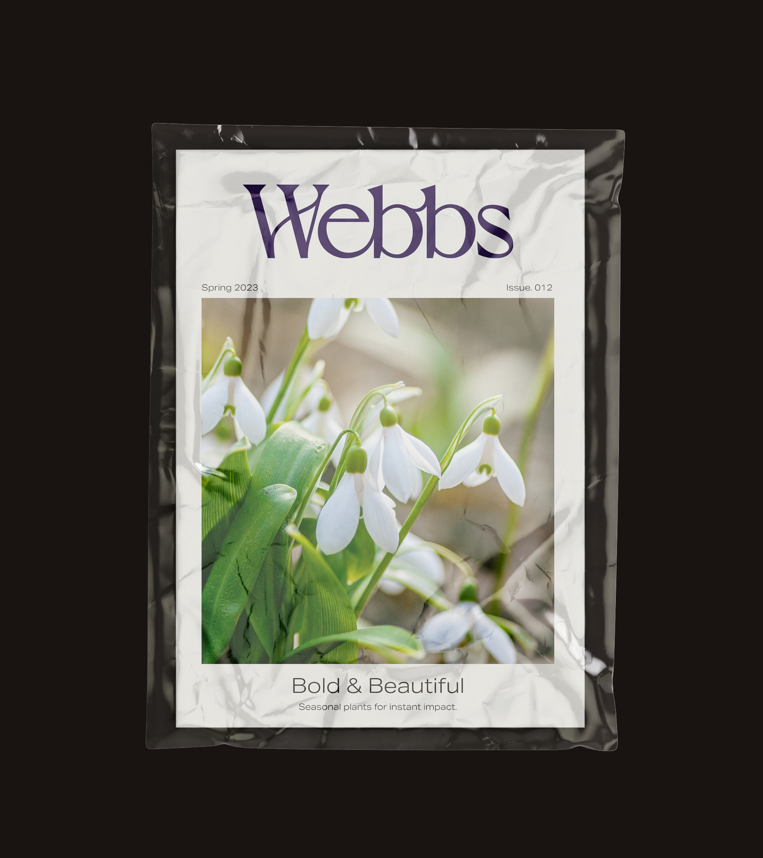
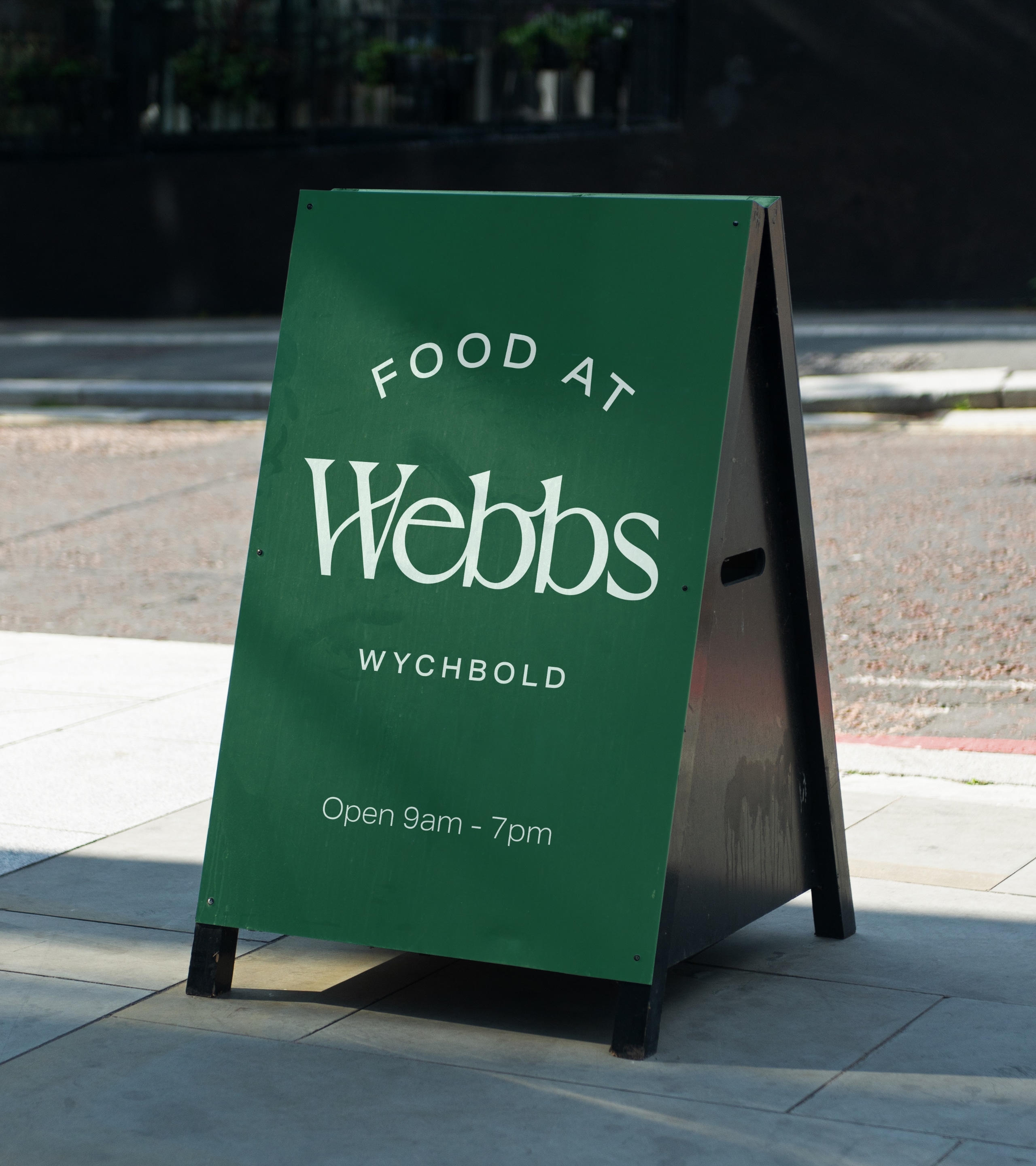
The new logo features plant-like connections and ligatures that complement the Art Deco type style, providing a timeless, natural feel to the identity. Sub logos were created to unify all departments and sub-brands under the Webbs branded house. The result is a consistent and elegant re-brand which brings Webbs into the 21st century whilst honouring the brand’s rich history.
Awards
- Transform Awards Europe 2024 – Silver – Best Visual Identity for the Retail Sector
Sector
Branding