Trends
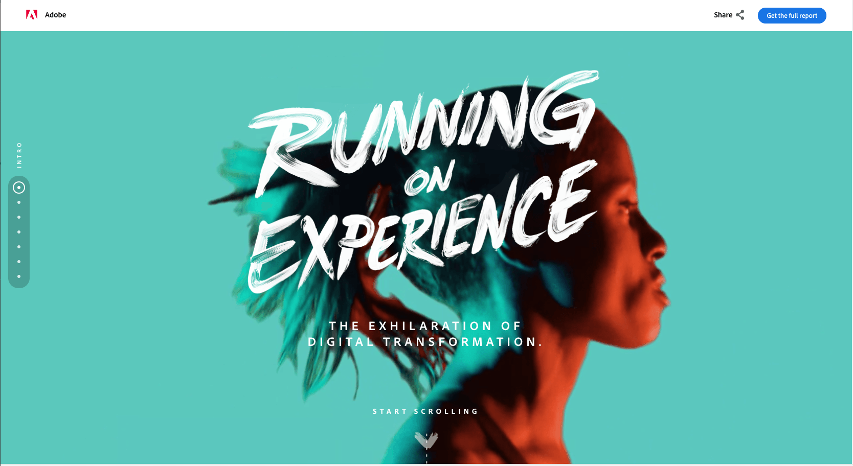
Web Design Trends for 2018
24th April 2018
How to keep up with the ever changing digital environment
The digital environment is ever changing. The constant advances in development allowing a progressive platform for designers to play within, breaking down the barriers that websites once held for designers. This has led to many new trends (or fads!) But it has also started to shape the digital platform, and what designers now address as common practise when designing a website. So what has this meant for web design and development in 2018?
Designing for the small screen of a hand held device was originally seen as an exercise that would have to strip the website down to its bare minimum. This often meant losing interesting visual content. Thankfully designers are now using this as an advantage, as more and more sites are using minimalism as the main focus of their design. This not only satisfies the needs of designing for a small screen, but streamlines the user experience. Creating a much more thought out design process which is intuitive to use and looks visually impactful.
Apple pioneered the way for minimal looking websites, and are still at the forefront. But designers are taking it to another level of minimal cool, striping it back to the basics of image and word to good effect. A great example of this the stylistic site of designer home goods, Kvell.
A picture is worth a thousand words
Following on from the minimalistic approach, one way to communicate efficiently is via carefully curated photography. More and more budgets are being spent on well thought out photography shoots. So why would you then squeeze this imagery into a small area on a website? Simply hero it!
For a while now full bleed photography has been en vogue for websites, but this seems to be a staying trend. The development on from this being the integration of motion into this imagery. Whether it be the use of cinemagraphs, animation of over layered text, or the further integration of full video.
The Essentially Geared Wine Company have integrated the full screen moving image, and text animation to good effect. While the beautifully shot food of the artisan boulangerie Grandir-kyoto set the whole mood for the site without having to explain a thing. Lifestyle photography is being used in abundance on websites, with outdoor aficionados Patagonia setting the scene for their products very well.
Typography is key
More and more exciting typography combinations are being used within websites to give distinct and enjoyable visuals. Big, bold and beautiful is the way to grab attention. Web fonts have come along way. Often the selection of typography on a website can almost distinguish a brand and make it more memorable.
Charge Bikes have used big bold typography to tie their web site directly to their products, with strong visual effect. While the Dutch Franshals Museum’s bold typography selection, makes for a great fresh impact on screen. (Try resizing their screen for a cheeky little tone of voice too!)
Vibrant Colours
With better screen technology constantly being developed, Colour use in websites is becoming ever more important. Websites are becoming more vibrant in colour, making use of both new technologies and creating visually stunning design pieces. Adobes Digital Marketing micro-site showcases such vibrant colour palettes. Strong brands colours are a great asset to utilise on screen, the Dutch 7up site being a great vibrant example.
Breaking out of the grid
Designers are now having the confidence to break out of the grid environment, resulting in a more varied digital landscape on the web. Asymmetric web pages are now becoming more widely used, and the challenge of them degrading down well to fit smaller devices is being relished by designers and developers alike. Making a much more interesting experience for web users and the brands that challenge the old grid format.
A much more fluid, editorial feel can be created with the asymmetrical layout. A great example is the curated women’s lifestyle website Not Your Standard, where the feel of a fashion magazine layout has been achieved.
Time Saving Design
Peoples attention spans are now being measured in nano seconds. If a website does not engage the user, or help them achieve the task in hand quickly, they will simply go elsewhere. This has led to the web design process becoming more considered right from the initial UX stage, through to the UI stage, for a intuitive, flawless journey.
Whether it be finding accommodation abroad or a local garage to book your car in for an MOT, a clean simple user journey must be adopted to ensure conversion. The simplistic minimal route again is king, with a hand full of big brands using this approach. Great examples include Airbnb with its use of automated suggestions fields, and limited numbers of steps to get to what you are looking for. Displaying results in a clear and simple fashion.
In a web nut shell, ‘simplify’ your website. Streamline the user’s journey, but engage in a stimulating manner. Make use of the basic design staples of photography, typography, layout and colour well. Strip back the user interface and make the site as easy to use as possible. The web is a big place and people can easily be distracted away from your site, so engage them!