Trends
Trends for 2018 – Design and Print
22nd January 2026
The trends set to influence design and print across 2018
As we begin the new year, we look to the design and print trends that we can see influencing creatives across 2018.
Ultra Violet
Now that Pantone has named Ultra Violet as its Colour of the Year for 2018, we have no doubt that we’ll be seeing it a lot this year in the design world. The vibrant shade of purple has many connotations ranging from more literal motifs like stars and planets, to deeper emotions like our sense of discovery.
Duotone and Double Exposure
Creating the illusion of ‘seeing double’ duotone and double exposure in design is going to be a big trend for 2018. This fundamental printing technique has found a new lease of life in design for this year. Applying a limited, complimentary colour palette to a semi-flat design achieves ‘an ahead of its time’ effect.
Colour Fonts
If you haven’t already started experimenting with colour fonts, then it may be time to give them a try. We believe that colour fonts are going to be the big trend in typography this year.
Why? Because the Adobe gurus have enabled software within their latest releases (Photoshop CC 2017/2018 and Illustrator CC 2018) which make it easier than ever to create them! These updates will allow designers to create bespoke, playful and vibrant typefaces that are bang on trend.
Gradient Design
Gradient design will be making a big comeback this year. The smooth transitions of colour which were once on every page of a Powerpoint presentation have been given a new lease of life by designers. Flat designs are really evolving and gradients are being used beautifully to enhance them. We’re already seeing them all over the digital and web but expect to see this trend appearing across print design too.
80’s Graphics
In 2018, we are gonna take it back to the 80’s! We are already starting to see some nostalgia within designs with the use of busy patterns and bright, electric hues. If you’re wanting to target trend-setting millennials, this is the way to do it.
Bright Colours
We’ve heard on the grapevine that the word on everyone’s lips this year will be ‘make it pop!’ With this in mind, we reckon that bright colours will definitely be at the top of design charts for 2018. The use of vivid shades will allow designs to stand out from the rest, look aesthetically pleasing and most of all…pop!
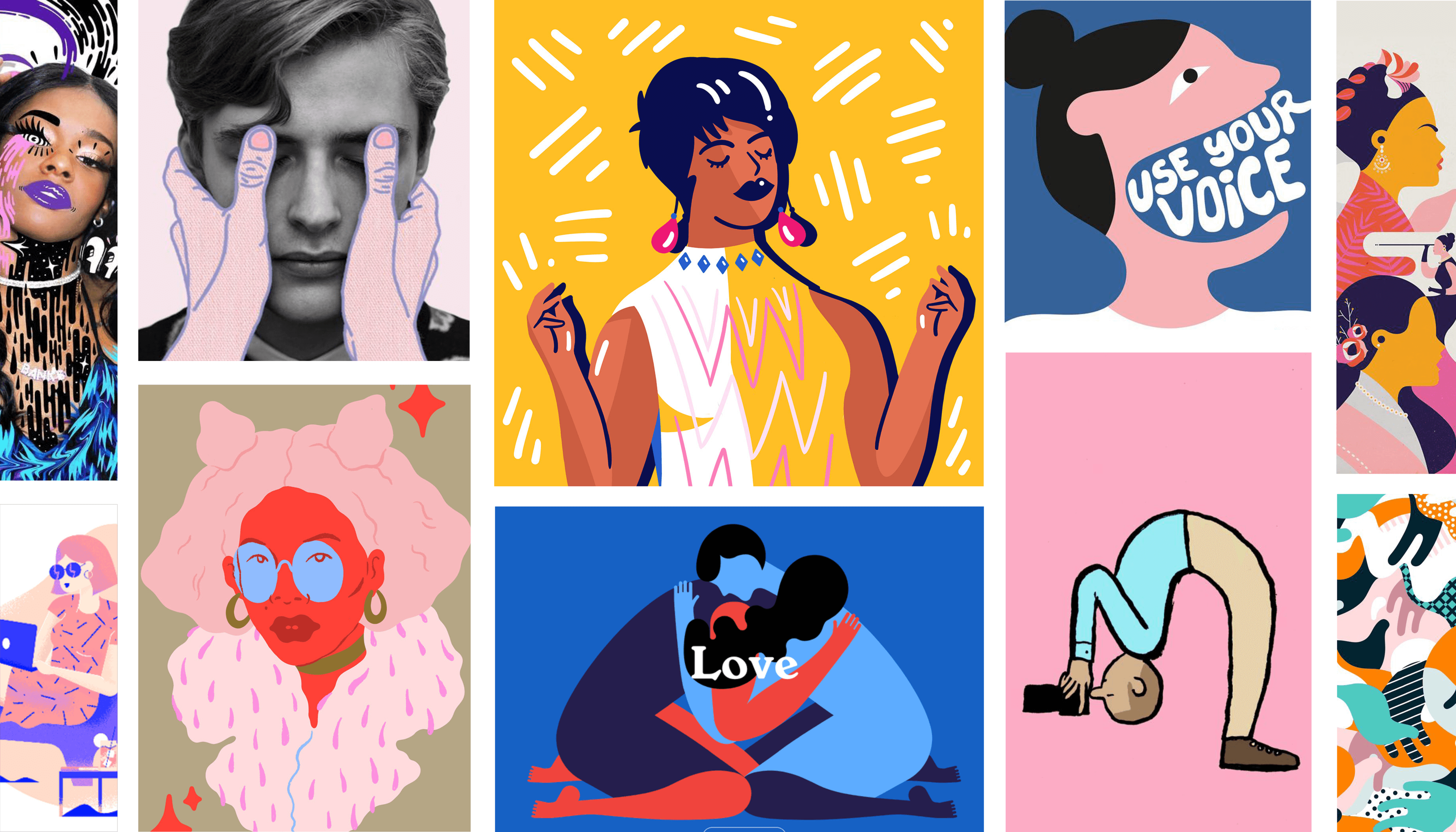
Graphic Art and Illustration
As we embark on the new year, the demand for custom graphic art and illustration is set to grow. Playful, practical or purely aesthetic these illustrations bring a unique vibe to design and print.
Mondrianism in Web Design
Mondrainism is a classic art style which has now been given a modern twist by being optimised for web design. The mosaic-like design grids create structure and use any given space to its full potential.
3D Elements
We’ve noticed recently that 3D elements are being used a lot within design and print, and that is only set to increase in 2018. 3D Graphics add a whole new dimension and personality to design. Team them with vibrant colour palettes and you’re onto a winner.