Trends
2018 – The Year of the Custom Typeface

We explore the boom in custom typefaces and the brands who have launched their own this year
Instant recognition is the holy grail for all brands, to be instantly recognised by a colour, a shape or even a sound (We all recognise the Intel chime that rings out at the end of an ad). Coke is recognisable by just a red can, no logo, no typeface. Whilst these are international brands with huge budgets a bespoke typeface is a great way for a challenger brand to kick start that instant recognition.
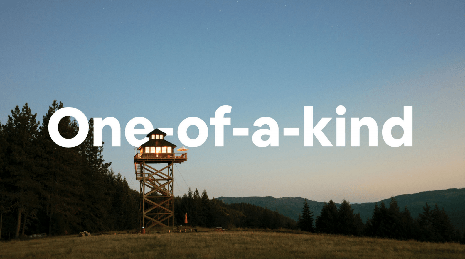
So why has 2018 been such a prolific year for the bespoke corporate typeface? YouTube, Netflix, Coke and Airbnb have all made high profile releases. For global brands that put out millions of individual pieces of communication, especially through digital channels, instant recognition is as vital as the message itself and a custom typeface allows you to communicate your values with just the shape of a letter.
The concept of a custom typeface in itself is nothing new, some of the worlds biggest brands have developed typefaces for which they have subsequently become renowned for. Although now replaced by Nokia Pure , the original Nokia typeface created by Erik Spierkerman, Nokia Sans, defined Nokia’s global communications for over a decade. It’s Sans Serif became internationally recognised by millions of consumers.
Some less well documented recent creations are even better examples of how to exude brand character, personality and values. Colophon Foundries headline typeface, ‘Battlebridge’ made for the Kings Cross development helps to anchor the modern construction to its illustrious past. The area itself was once known as Battlebridge and the typeface beautifully recreates the feeling of the areas industrial heritage. There are ‘off-the-shelf’ character sets that could do this, but none as elegantly or with the same sense of uniqueness.
Chobani, the best selling Greek Yoghurt in the US launched their custom typeface along with their brand overhaul at the end of 2017 (almost 2018). The new face replicates the smooth product with its chunky and curvy serif, helping the sub brands hang together whilst keeping their own character. From the playful ‘Flip’ range of yoghurts aimed at a much younger audience to the ‘Hint of’ range with its delightfully minimal design all hang together perfectly and feel like the same family, all achieved with the creation of Chobani Serif and Chobani Sans.
So whilst a custom typeface can be a lengthy endeavour it gives any organisation unrivalled creative cut through, anyone in the business can type a few words in the bespoke typeface and everyone knows who the communication is from, powerful stuff!
