News
George High Summer
Bethany Hinton
26/07/21
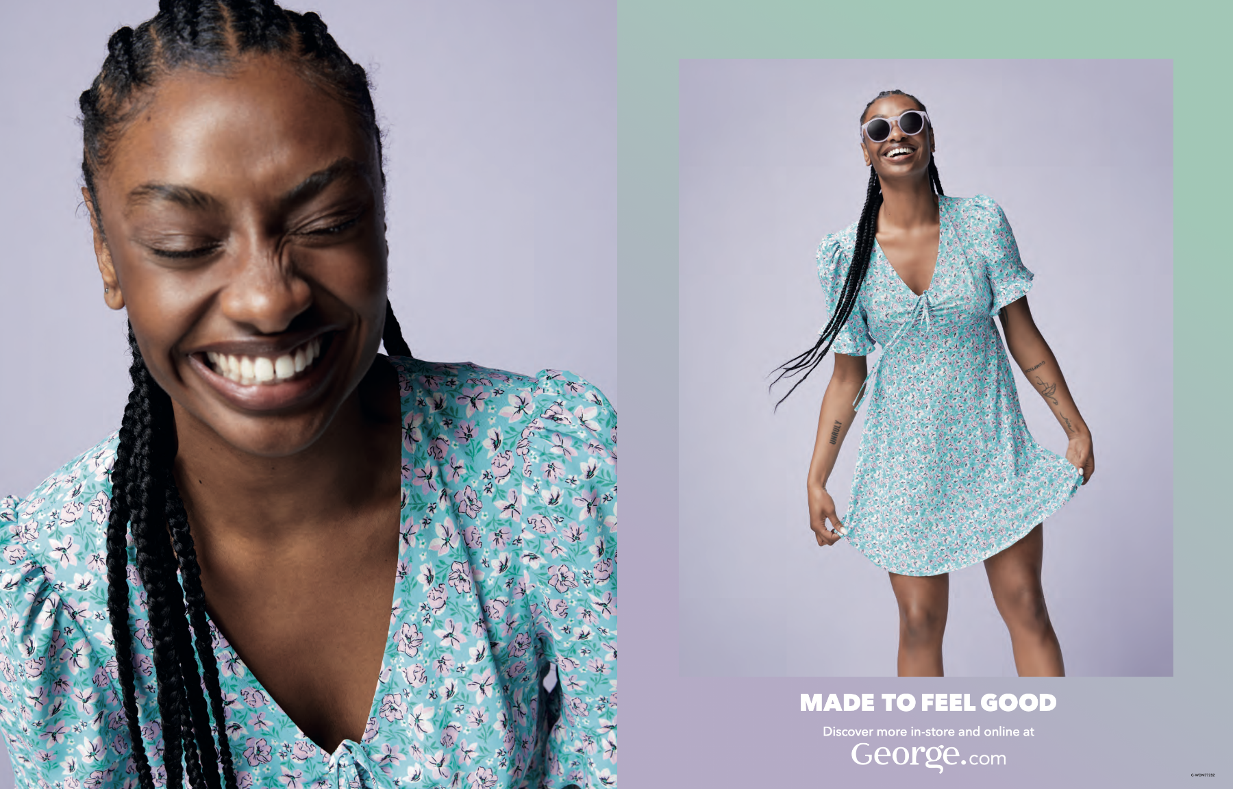
When asked to refresh the George Summer campaign for their high summer product launches, we were keen to incorporate a similar look and feel. We explored keeping the same gradient colour border as summer but refreshed to align with the lavender and sage colour pallet of the high summer shoot. It was also important to push the focus of new ranges to the customer, so we interlinked the ‘NEW’ lockup into the campaign concept.
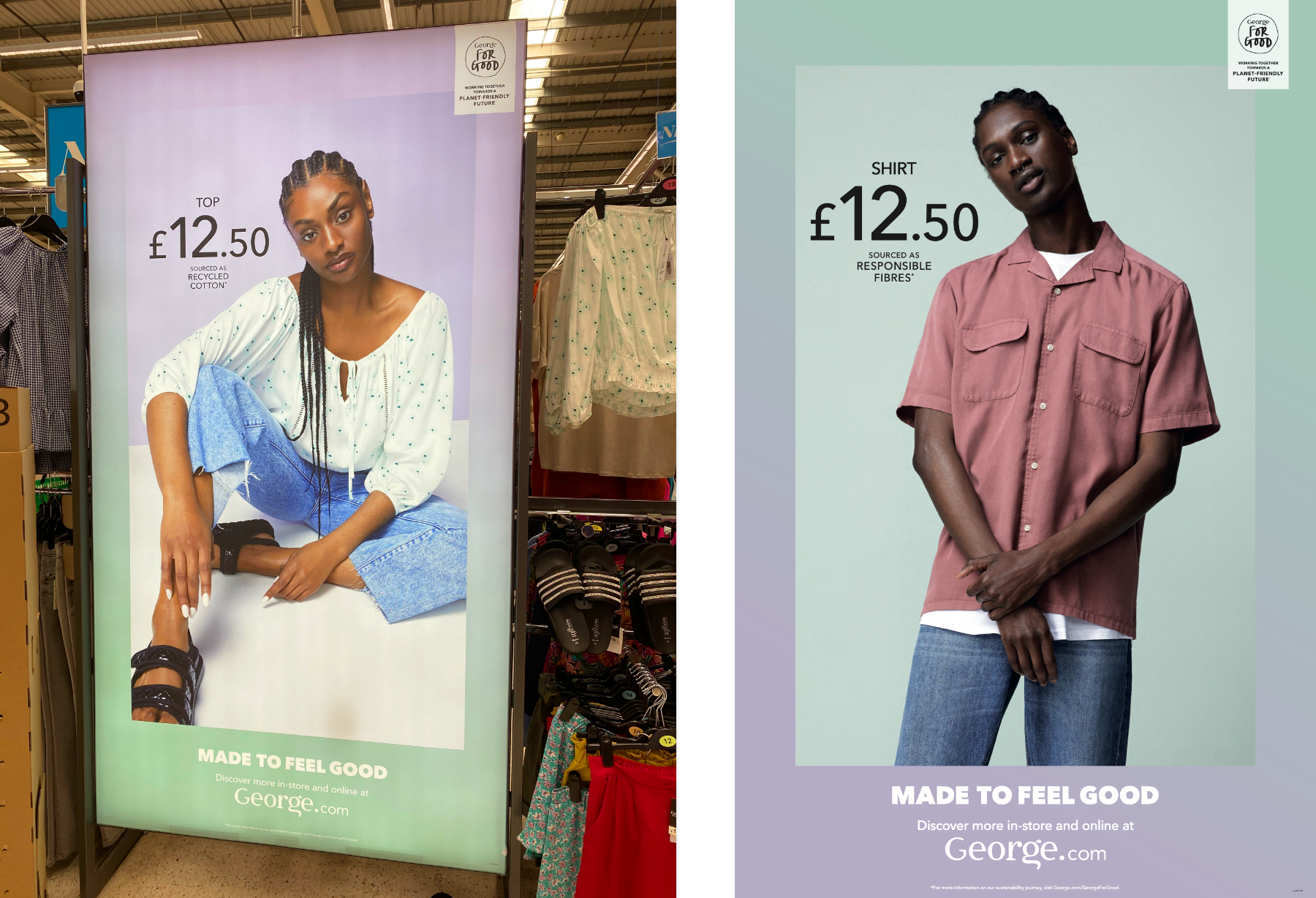
Once the campaign direction was set, we created a mini guideline of the concept which was supplied to all other agencies. We were then briefed to look at the press, social media, VM and POS.
The social animations were a perfect platform to really bring the ‘NEW’ lockup to life. We were able to have this moving across the screen behind the shot to really make the campaign message pop.
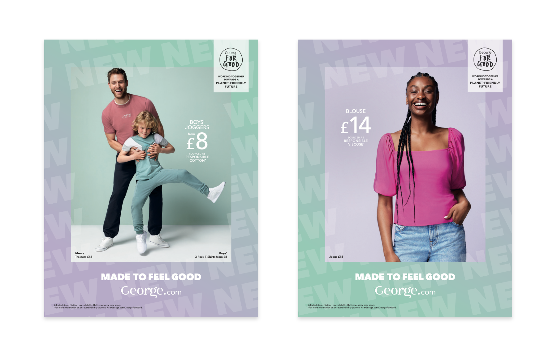
For in-store POS and VM windows, we had to adapt the campaign to work in a longstanding display. For this we striped back the ‘NEW’ lockup and applied just the lavender and sage colour gradient to the graphics. This still gave a fresh and new vibe to the stores which supported the concepts behind the campaign.
We were able to explore the graphic direction and campaign concept further with our Lavender Fields window displays for VM. We really wanted to push the boundaries with this display and utilise the whole space for their flagship store in Stratford-Upon-Avon. For this we created a lavender banner which covered the whole back wall and created a colour takeover of the space. We also incorporated the gradient borders into the windows display by using a gradient decal around the whole window and brought the campaign to life with some hanging borders to frame the mannequins.
Working on all these elements for the high summer campaign has been a huge team effort and has touched multiple disciplines throughout the studio. It’s been a great campaign to be a part of from start to finish.